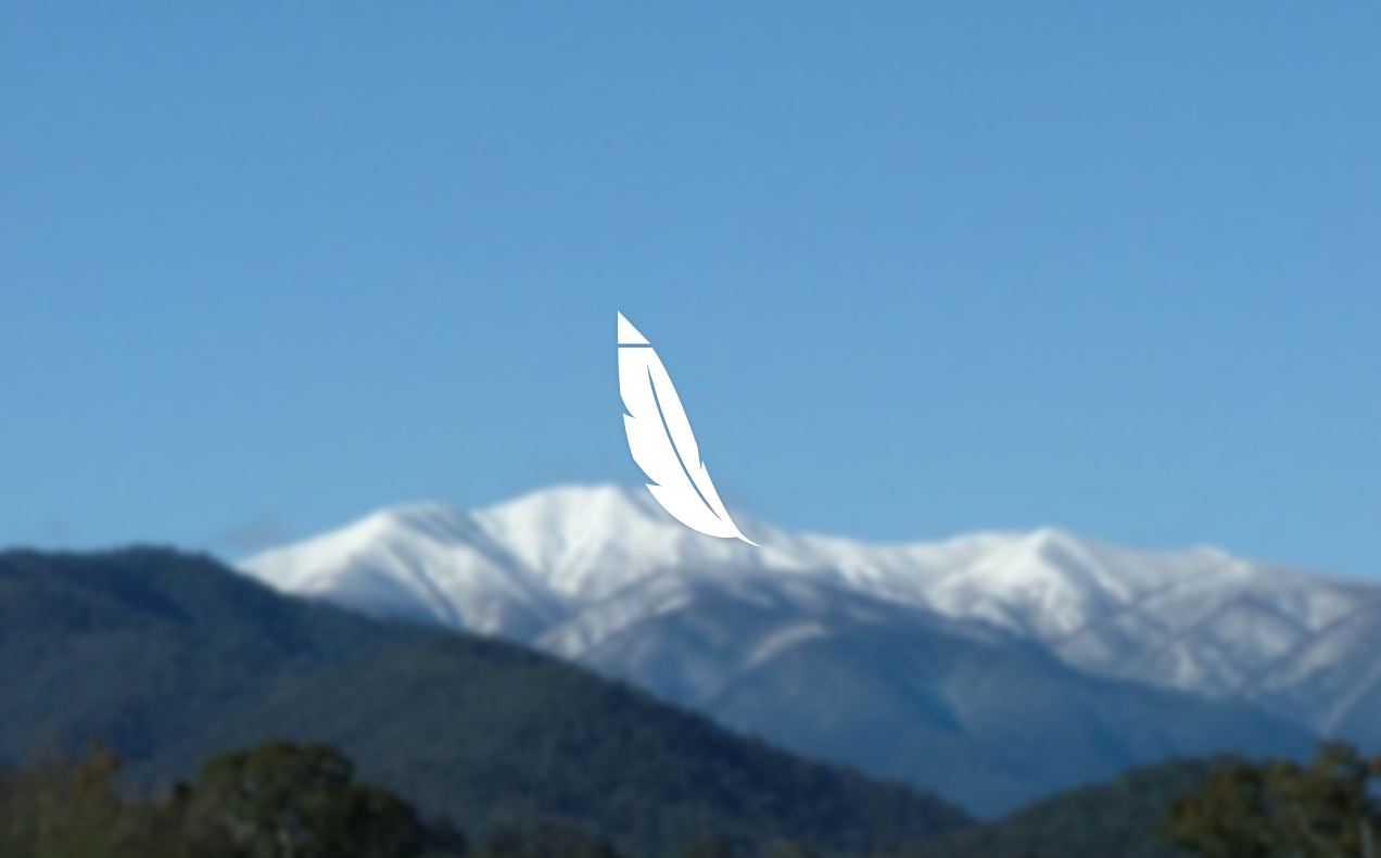

Logo for a running brand named Feathertop.
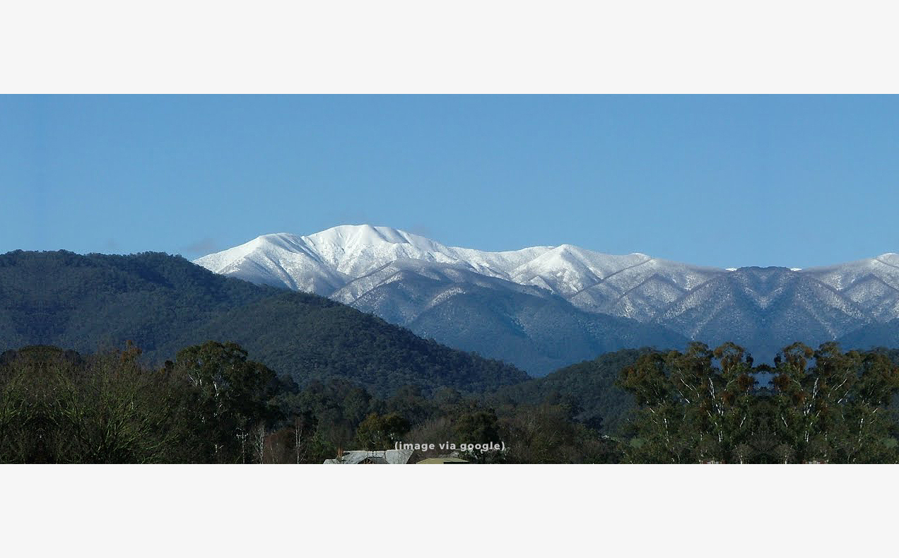
…Named after Mt Feathertop in the Victorian Alps [Southern Australia], and represents adventure and the belief that anything is possible. Our demographic is 20-50 year old males who run on trails and roads, or men that want to get into shape.
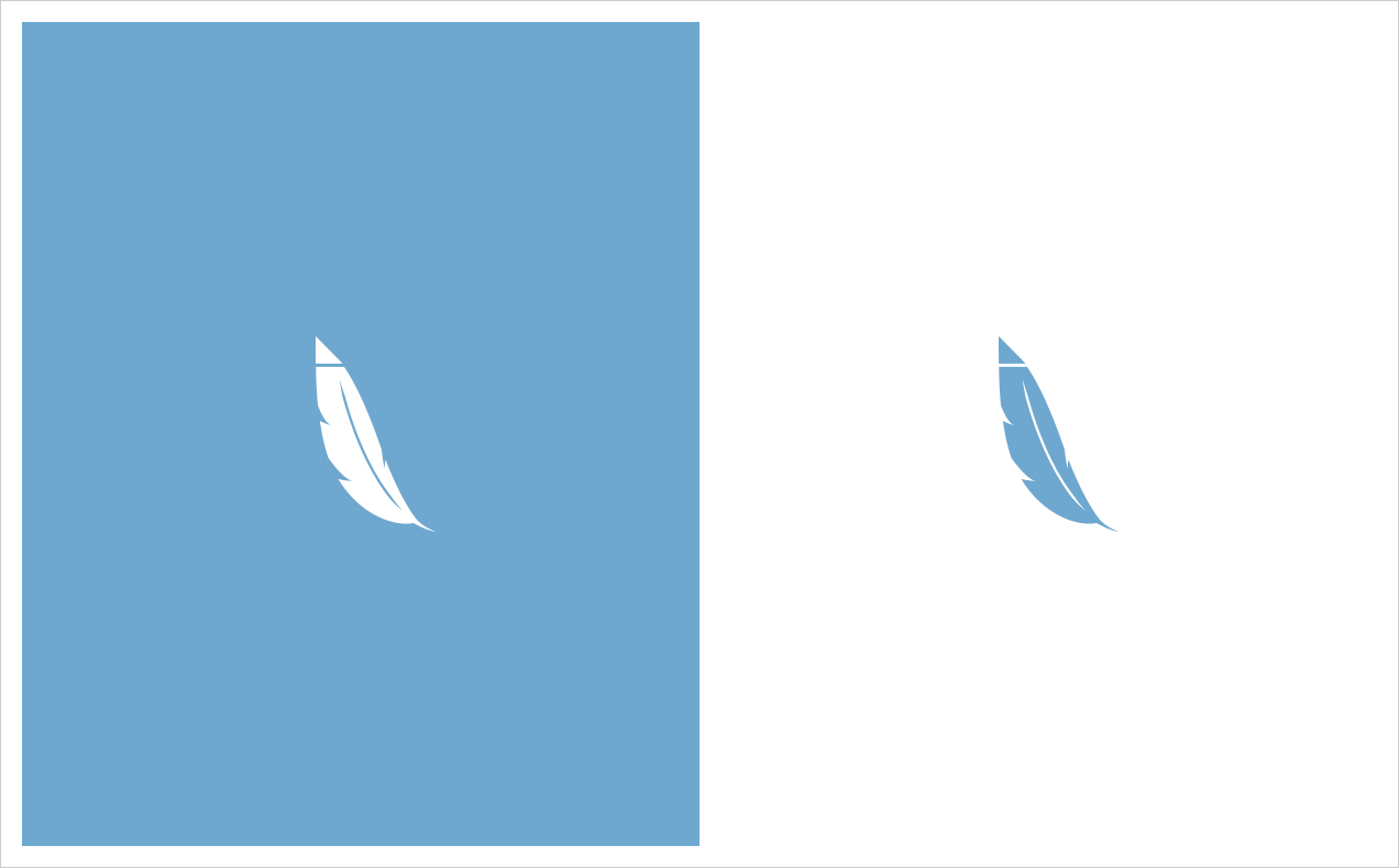
A simple, clean logo was needed to be used on clothing and all branding elements. My first version is an “F” with a feather on top, feather top…get it? The curved shapes help to make the logo more dynamic, light weight, and free which is an appropriate characteristic for a running brand. The type is set in Letter Gothic font because of its light weight appearance.


Version 2 is also a feather, this time standing straight up instead of floating. The triangle pointing upwards at the tip top of the feather represents the Victorian Alps.